Most couples spend weeks on the Nikkah certificate design and about thirty seconds on the frame color. Then the frame arrives, and it either quietly makes the whole thing look right, or it fights with the artwork, and nobody can say why.
The frame is not a minor detail. It’s the first thing people see, and it decides whether the certificate looks like part of your home or like a document someone leaned against the wall.
Here’s how I’d go about choosing, in the order that actually works.
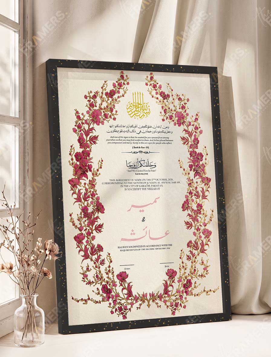
Start with the certificate, not the theme
This is the step people skip. They think “our theme is sage green and gold” and pick the frame to match the wedding. But the certificate is what sits inside the frame, so it comes first.
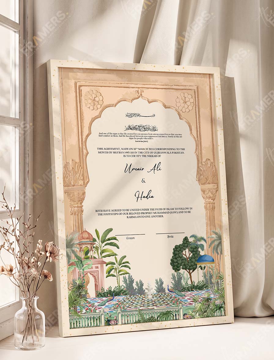
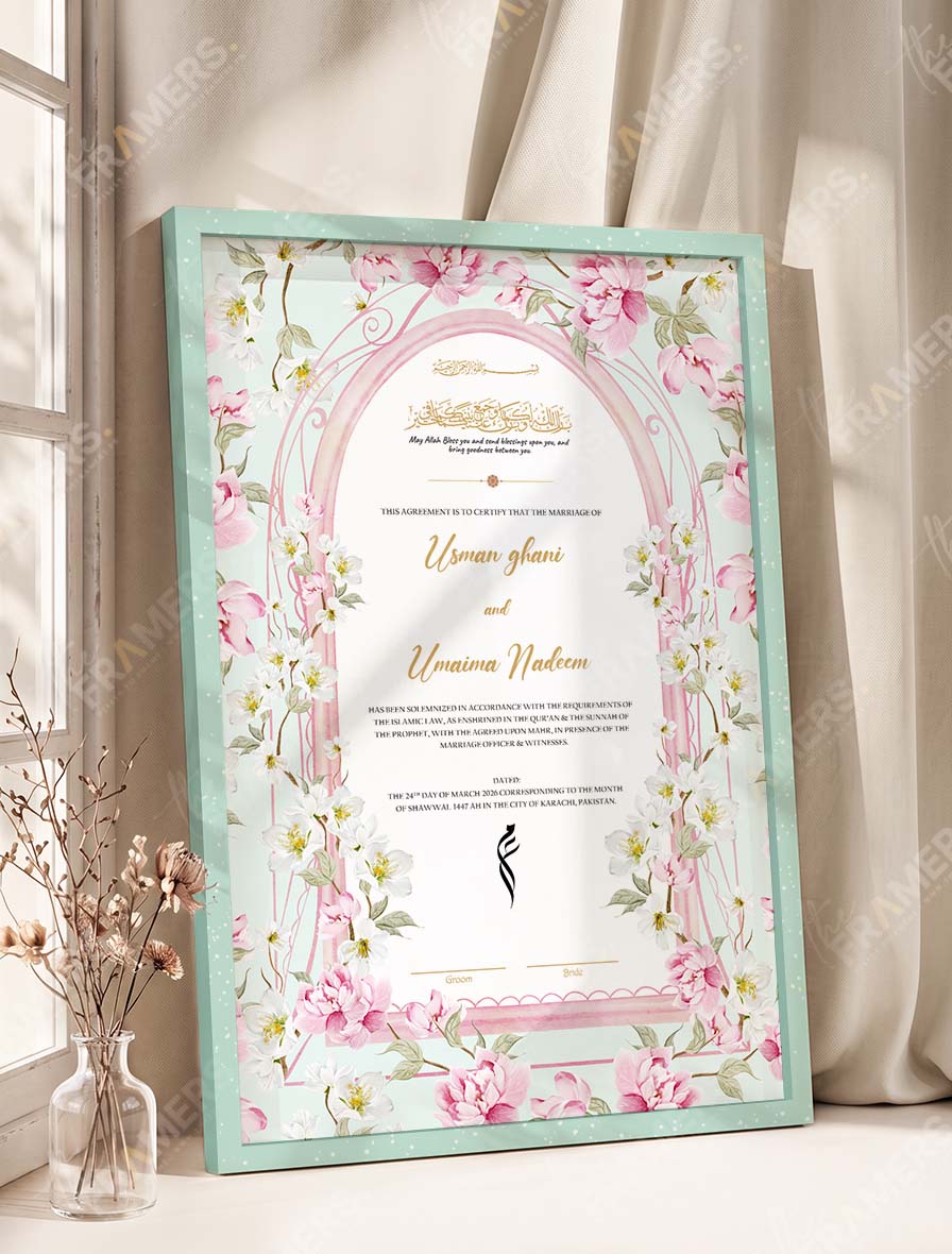
Look at your design and find the one color that shows up most often in the artwork. It might be the maroon in a border, the gold in the calligraphy, or the soft pink in the flowers. Your frame should echo that color or sit quietly beside it. It should not compete with it.
A simple test: look at the design from a few steps away, squint, and ask what color you notice first. That’s the color your frame has to respect.
Then think about where it will hang
A wedding theme lasts a weekend. The frame hangs for decades, usually in a bedroom or living room, so the wall matters more than the mehndi decor.
- Light walls (white, cream, beige) can take almost any frame color. Darker frames stand out more here, so a Fancy Black or Royal Cherry frame will look bold and deliberate.
- Dark or colored walls swallow dark frames. If your wall is deep green or navy, a black frame disappears. Go lighter, or choose a gold or wood tone that gives the edge some definition.
- Wood furniture nearby? Oak Wood or Brown will sit comfortably with it. A cold color like Ice Blue might feel slightly out of place next to heavy wooden furniture.
If you’re not sure where it will go yet, choose a neutral and don’t worry about it. You can’t go far wrong with wood tones or gold.
The 11 premium frame colors, and who they suit
Our premium color Nikkah frames come in eleven colors. Colors on a screen always look slightly different from the real thing, so treat what follows as a guide to character, not an exact match.
Warm and classic: Brown, Oak Wood, Fancy Golden
These are the safest choices, and safe isn’t a bad thing here. They work with almost every design, they age well, and they suit traditional artwork best: Mughal gardens, calligraphy, arabesque patterns.
- Oak Wood feels natural and slightly lighter. Good if your home leans towards wood and earthy tones.
- Brown is deeper and more formal. It suits the heavier, more detailed designs.
- Fancy Golden adds warmth and a little shine. It pairs well with anything that already has gold in the artwork, such as the Dusty Gold Illuminated or Gold Calligraphy designs.
Deep and dramatic: Fancy Black, Royal Cherry, Purple
These frames make a statement, and they need a design with enough going on to hold its own.
- Fancy Black is the most versatile of the dark options. It gives a clean, crisp edge to nearly everything, and it looks especially sharp with maroon-and-gold or emerald designs.
- Royal Cherry is a rich red that works beautifully with burgundy and maroon artwork. Pairing it with a very busy design can feel heavy, so keep that in mind.
- Purple is the least common choice, and that’s the appeal. It suits couples who want something different, and it works best when the design has a bit of purple or plum in it already.
Soft and light: Fancy Off White, Ice Blue, Peach Pink, Soft Sea Green, Olive Green
These are for couples whose taste runs gentle. They work best with watercolor and floral designs, and with light walls.
- Fancy Off White is the quiet one. It lets the artwork do the talking and suits delicate, light designs like Cherry Blossom Watercolor.
- Ice Blue and Soft Sea Green are fresh and calm. They suit blue, green, and botanical artwork, and a bright room helps them.
- Peach Pink is warm and romantic. It looks lovely with soft pink and floral designs, though against a very pink design it can look washed out.
- Olive Green is the most grounded of this group. It pairs naturally with sage and botanical designs, including the couple-illustration ones.
Matching the frame to your wedding palette
If your Nikkah has a clear color palette, you can still bring the frame into it without matching it exactly. Three approaches that tend to work:
- Match the accent, not the main color. If your theme is mostly ivory with gold touches, a golden frame feels connected. An ivory frame can look like it’s disappearing.
- Pick the color of the flowers or the stage. A single bold repeat is better than an exact match across everything.
- Keep it consistent with the small things. If you’ve already chosen a Nikkah dupatta and a Nikkah pen to suit your theme, look at those colors together. Your wedding accessories checklist is a good place to see how it all fits.
A quick cheat sheet
| Your theme or design | A frame color to look at first |
|---|---|
| Maroon, burgundy and gold | Fancy Black or Royal Cherry |
| Emerald, green and Persian patterns | Fancy Golden or Fancy Black |
| Soft pink and floral | Fancy Off White or Peach Pink |
| Sage, botanical, couple illustration | Olive Green or Oak Wood |
| Blue and grey tones | Ice Blue or Fancy Off White |
| Traditional Mughal and calligraphy | Brown, Oak Wood or Fancy Golden |
| You really aren’t sure | Oak Wood or Fancy Black |
Mistakes worth avoiding
- Matching the frame to the certificate’s background. A cream frame on a cream design just fades out.
- Choosing on the theme alone. Your wedding colors may not look right on your wall in three years.
- Going very dark on a very busy design. The frame and the artwork end up competing.
- Choosing from a screen in a hurry. Before anything is printed, we send you a digital sample on WhatsApp, so you can see your own design and check the color first. Use it.
Where to hang it
Once the frame is chosen, see our guide on how to hang frames on a wall. If you’re still weighing whether a frame is worth it, here are five reasons a custom Nikkah frame becomes an heirloom.
Frequently asked questions
Should the frame match the certificate or contrast with it?
Either can work. A matching frame feels calm and cohesive, and a contrasting one feels bold. If you’re unsure, go with a tone that matches one color in the artwork.
What’s the safest frame color if I can’t decide?
Oak Wood and Fancy Black are the easiest. Both go with most walls and most designs.
Can I choose any frame color with any design?
In the premium collection, yes. All eleven colors are offered on the designs, and you pick yours on the product page.
Will the color look the same as on the website?
Close, but screens vary, and so does the lighting in your room. That’s why we send a digital sample on WhatsApp for your approval before the frame is made. If a color matters to you, check it there.
How long does a framed certificate take?
Framing takes 3 to 5 working days after you approve the digital sample. Courier delivery then takes 1 to 2 days in Lahore, and 2 to 4 days in Karachi, Islamabad, Rawalpindi, and other cities. If your Nikkah date is close, message us first.
How much does a premium color frame cost?
Prices start from Rs. 4,990. For the exact total for your design, color, and size, message us on WhatsApp.
Ready to choose?
Browse all the premium color Nikkah frames, or look at our full range of customized Nikkah certificates. If you’d like a second opinion on a color, send us your design on WhatsApp, and we’ll tell you what we’d choose.